

The problem with patterns: how good data leads to bad decisions
Collider bias and the misreading of school data

A headteacher told me an interesting story recently. Her behaviour lead had been analysing the incident logs for a small group of students already identified as presenting the greatest behavioural challenge when she noticed a pattern that looked too consistent to ignore. Their most serious incidents clustered around the same corridors, the same points in the day and the same few teachers. On the face of it, the data appeared to offer a useful diagnosis: these students’ behaviour seemed to deteriorate in particular contexts. Perhaps those contexts were not incidental. Perhaps they were causal.
So, as is usually the case when a pattern in the data seems to clarify a messy problem, the school sprang into action. Although everyone was already aware of the small group of high profile students, the new information focussed on where, when and with whom the most serious incidents seemed to occur. Attention therefore shifted to the contexts that appeared to be producing the behaviour. The teachers whose lessons appeared most often in the logs were offered support, and middle leaders were asked to look more closely at the relevant lessons, corridors and transition points.
For a while, it seemed to work. The number of high-tariff incidents fell. The behaviour lead’s hunch appeared to have been confirmed. The pastoral team felt encouraged. Senior leaders were relieved. The graphs moved in the right direction, and the school began, cautiously but understandably, to congratulate itself on having found the source of the problem. The only people less convinced were the teachers whose lessons had been placed under scrutiny.
Then, within the space of a week, three of the students at the centre of the original analysis were permanently excluded following serious incidents.
So what had gone wrong?
The evidence, though accurate, was misleading. The students really had been involved in incidents clustering around particular places, times and lessons. And the teachers’ names really did appear more often than others. The trouble is, data sets are unable to tell the full story. In this case, the pattern had been imposed before anyone began to interpret the data.
A behaviour log is not an accurate transcript of school life. Incidents are only recorded after a chain of judgements has already taken place: what was noticed, what was tolerated, what was challenged, what was escalated, what was written down, and what was dealt with in ways that never entered the system at all.
Ask yourself why some incidents might be logged while others might not. What are the factors that could lead to this outcome?
Here a few of the possible variables:
Some teachers follow the behaviour policy closely and log every incident that meets the threshold.
Some teachers trust the system and believe logging will lead to useful action.
Some teachers don’t trust the system and have learnt that logging rarely changes anything.
Some teachers have different thresholds for what counts as serious enough to record.
Some teachers avoid logging because they worry (often correctly) frequent incidents will make them look unable to cope.
Some teachers deal with incidents informally before they reach the official system.
Some teachers absorb too much disruption because they’ve normalised it or feel there’s no alternative.
Some teachers log less because they don’t want to damage relationships with students.
Some incidents are logged because they are highly visible: shouting, refusal, walking out, aggression.
Some students are logged more readily because they already have a reputation.
Some incidents are not logged because the system is time consuming, awkward to use or unclear.
Some incidents are logged because they involve students already under review.
Some incidents are/are not logged because they fit descriptions in the behaviour policy.
Some incidents are/are not logged because they trigger an automatic sanction.
If we consider just the variables dealing with teachers, we could assume that incidents are more likely to be logged by teachers who:
a) Follow the behaviour policy closely and believe consistency matters.
b) Trust leaders to respond fairly and use the information properly.
c) Are less confident managing behaviour and want support or escalation.
d) Are new to the school and trying to follow the system exactly.
e) Notice, challenge and record behaviour others may tolerate or absorb.
While there may be some over lap between some of these factors, we can be fairly sure that teachers a and e are probably distinct from theachers who fall under c. A cluster around particular teachers might indicate weak routines, difficult classes or poor relationships. But it might also indicate higher standard and fidelity to the behaviour policy. An absence of logs might suggest calm, well-established classrooms, but might just as easily suggest avoidance, resignation or invisible disorder.
In this case, once attention shifted to the teachers and locations that appeared most strongly in the data, the system changed. Teachers knew they were being watched. Some became more cautious about what they recorded. Some managed more incidents informally. Some may have hesitated before escalating because escalation had begun to look like evidence against them. The behaviour logs improved, but that didn’t necessarily mean behaviour had improved.
The school had mistaken a pattern for a cause. The data had clustered around particular lessons, corridors and transition points, but that didn’t mean those contexts were producing the behaviour. They were simply the places where behaviour was noticed, challenged, escalated and recorded. Just as a map is not the territory, a behaviour log is not behaviour itself, but the paper trail it leaves behind.
The statistical name for this particular problem is collider bias. When two or more factors influence whether something appears in a data set, and we then look only at that selected group, those factors tend to appear to be related in ways that mislead us. The collider is the selection point, the place where different causal paths meet, and the source of the trouble is that selection can create patterns which look meaningful precisely because we have forgotten that selection has occurred.
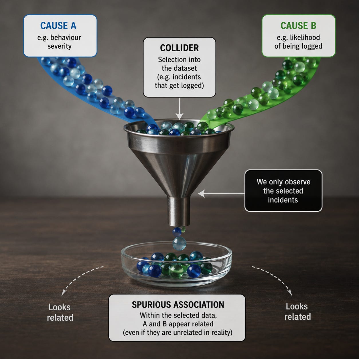
Imagine a university that admits students partly because they have high test scores and partly because they’re very wealthy. In the general population, ability and wealth may be related, unrelated or only weakly related. Yet among admitted students, a pattern appears: less wealthy students may tend to be especially able, while less able students may tend to be especially wealthy. In a selected group where either advantage can help secure entry, those who lack one advantage are statistically more likely to need the other.
The university, by acting as a filter, has created an apparent relationship between ability and wealth. It may even make the two qualities look as though they trade off against each other, when what we are really seeing is the effect of the admissions process. Collider bias is a mechanism for manufacturing plausible falsehoods.
In 1946, Joseph Berkson showed how hospital samples could produce misleading associations between diseases. Suppose two different conditions both increase the chance that a person is admitted to hospital. If instead of looking at the wider population we study only hospital patients, the two conditions may appear negatively related. Among people already in hospital, someone who doesn’t have one condition must have some other reason for being there.1
The hospital, like the university, is the filter. What became known as Berkson’s paradox was later absorbed into the wider development of causal inference, particularly through the use of causal diagrams, or directed acyclic graphs. In these diagrams, a collider is a variable with two arrows pointing into it: X causes Z, and Y causes Z. If we leave Z alone, X and Y need not be associated; but if we condition on Z, by selecting only cases where Z occurs, controlling for Z, or comparing only within levels of Z, we may open a path between X and Y that wasn’t there before.
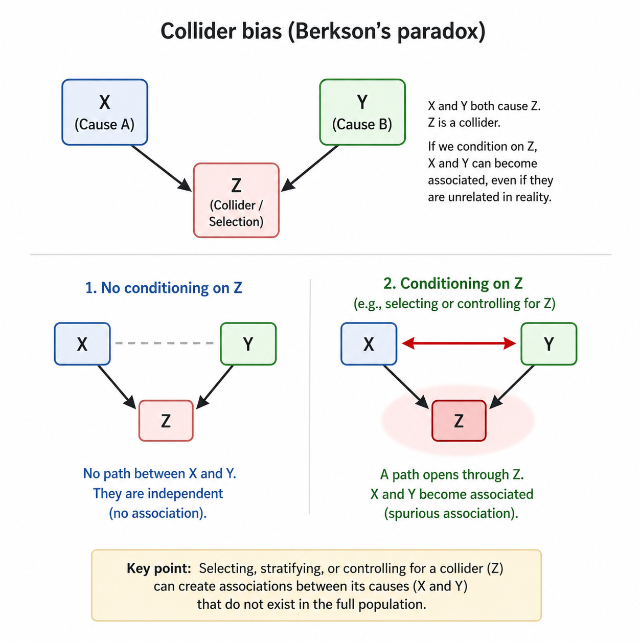
Although better analysis usually means controlling for more variables, this depends on understanding the difference between confounders and colliders. Confounders are common causes, whereas colliders are common effects.
Suppose we analyse our data and find students who attend revision sessions get better results. Should we make all students attend revision sessions?
Motivation may be a confounder because it sits upstream of both: motivated students are more likely to attend revision and more likely to revise independently, complete homework and do well in the exam. If we fail to account for motivation, we’ll give the revision session too much credit.
But selection can also create a collider. Suppose we look only at students who attended revision. Some students were there because they were highly motivated; others were there because they were seriously underprepared and had been required to attend. Within that selected group, motivation and prior weakness may appear to trade off against each other: the most motivated students may look less weak, while the weakest students may look less motivated. But that pattern may have been created by the fact that either motivation or weakness could get a student into revision in the first place. The revision session is the collider: a common effect, not a common cause. Controlling for a confounder may reduce bias; controlling for a collider creates it.
Medicine has had to take this seriously because so much medical evidence is observational, partial and filtered through systems of access, diagnosis and recording. During COVID-19, researchers warned that analysing only people who were tested, infected or hospitalised could distort relationships between risk factors and outcomes. Testing and hospitalisation wasn’t random. Age, occupation, symptoms, health behaviour, existing illness and access to healthcare could all affect who appeared in the data, which meant that, once researchers looked only at one selected group, some relationships could appear weaker, stronger or simply stranger than they really were.
The so-called obesity paradox raises a similar problem. Some studies have suggested that, among people already diagnosed with certain conditions, higher body weight can appear to be associated with better outcomes.2 Of course, there may be biological explanations in some cases, and it would be foolish to dismiss that possibility out of hand. But collider bias fits the facts: if body weight and illness severity both affect diagnosis, hospitalisation or inclusion in a study, then studying only diagnosed or hospitalised patients will distort the apparent relationship between weight and survival.
If you’ve been thinking that this all sounds pretty similar to survivorship bias, you’d be right. During the Second World War, analysts examined bullet holes in returning aircraft and, quite reasonably at first glance, concluded that armour should be added where the bullet holes were most common. Fortunately, Abraham Wald saw the flaw. The planes that returned had survived those hits; the missing planes mattered more. Armour was needed where returning aircraft had fewer bullet holes, because planes hit in those places were less likely to make it back.
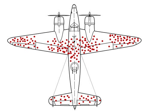
Survivorship bias is about what sample leave out; collider bias is about the false relationships samples can create. Observed cases have survived a selection process, and that process is part of the evidence. If we ignore this fact, our data may point in exactly the wrong direction.
Once you understand the problem, examples begin to appear everywhere. A dating app can make attractive people seem boring and interesting people seem unattractive, but that’s because you’re only looking at people who have passed through some combination of attractiveness, wit, proximity, availability, algorithmic visibility and your own habits of attention. If someone is less attractive, they may need to be more interesting to catch your attention; if someone is less interesting, they may need to be more attractive. The app doesn’t show you the broad sweep of humanity, just the cross section you’ve selected.
Hollywood creates a similar illusion, making it seem as though beautiful actors can’t act and brilliant actors are less atractive, but the visible sample has already been filtered by beauty, talent, connections, luck, persistence, timing and notoriety. Those with neither beauty nor talent disappear from view long before we start forming theories about the relationship between the two. Among those who remain, beauty and talent may therefore appear to trade off because either can help someone survive the selection process.
Elite sport produces its own versions of the same mistake. A smaller footballer may need exceptional technique, balance and anticipation to survive selection, while a technically ordinary footballer may need unusual speed, strength or stamina. Among professionals, qualities can look as though they substitute for each other, even when they may be positively related in the wider population. The academy, the scout, the coach and the contract have already filtered the sample before the pundit begins to explain it.
Business is full of this sort of nonsense. A company studies its top salespeople and finds they all ignore the script, so it relaxes the script and then wonders why sales fall. The problem is that only the successful rebels were studied. Success selected the sample, and, within that selected sample, rule-breaking looked like genius.
Social media may be the most efficient collider engine ever built. The posts you see are selected by outrage, novelty, status, timing, your previous behaviour and the platform’s appetite for attention. You then infer truths about the world from what survives that tournament. Everyone seems furious, every debate seems polarised, every institution seems to be collapsing, and moderation appears to have vanished. Some of that may be true, but your feed is not a reliable survey.
Now return to the headteacher and the behaviour log. Once we recognise that behaviour incidents appear in the log only after a chain of events has taken place. The reason she was telling me the story because she’d seen through the flawed data pattern and realised they were in danger of penalising teachers for using the very system they relied on for information. The best way to improve a system that relies on teachers being willing to log incidents is to incentivise them to do so by making sure you’re trustworthy. If teachers can’t trust leaders to either interpret the data correctly or help manage incidents when they arise, why would they bother to continue using a broken system?
We may believe the log is giving us information about patterns of student behaviour but what we’re actually seeing is a survey on who uses the system, how often and for what. That doesn’t make the data useless but it does mean that it’s partial. If we want to find out where and how students behaver there is no substitute for boots on the ground.
Schools are constantly looking at selected groups: students removed from lessons, students receiving intervention, students attending revision, parents who complain, departments below target, teachers who request coaching, students entered for foundation tier, persistent absentees and children labelled as causes for concern. These categories can be useful, and often they’re necessary, but they’re never neutral. Here’s a list of some the wasy we both rely on data and routinely fall victim to collider bias:
Managing risk: removals, repeated sanctions, persistent absence and safeguarding concerns demand attention.
Rationing scarce resources; Intervention, tutoring, mentoring, pastoral time and coaching can’t be offered to everyone.
Meeting accountability demands: Disadvantaged students, SEND students, borderline candidates and persistent absentees have to be tracked.
Making messy problems easier to discuss: “Year 9 boys in science” is easier to handle than a knot of curriculum, status, staffing, routines and prior attainment.
Studying the cases that seem most relevant: Exclusions are analysed through excluded students, intervention through students in intervention, complaints through parents who complain.
Starting after the filter has already operated: By the time a student is labelled “persistent absentee” or a teacher “causing concern”, earlier decisions have already shaped the category.
Turning labels into explanations: “challenging students”, “weak teachers” and “hard-to-reach parents” begin as descriptions and harden into causes.
Comparing groups: Students who attend revision, receive intervention or get removed aren’t randomly assigned.
Once a category exists, we start treating it as self evident. And what’s easy to record becomes all we know.

The easy availability of data makes it tempting to study spreadsheets instead of doing the hard, dull work running a school: visiting lesson, patrolling corridors, talking to teachers and students, looking for what isn’t logged, asking which students are invisible, examining where policies are being followed and where they’re being worked around, and considering whether the systems we put in place reward accuracy, compliance, avoidance or performance.
Knowing about collider bias doesn’t mean we should ignore evidence but that we should stop mistaking selected evidence for reality. Sometimes where the evidence looks clearest is also where it’s hardest to see the truth.
Joseph Berkson, “Limitations of the Application of Fourfold Table Analysis to Hospital Data”, 1946. Berkson showed that two diseases independent in the general population may become “spuriously associated” in hospital-based studies.
See Banack and Kaufman’s 2014 paper on the obesity paradox in cardiovascular disease. They note that many studies have reported an apparent survival advantage for obesity among people with CVD, and they discuss how selection and collider bias may help explain it.